
The Power of Visual Branding – Infographic
Unveiling the Canvas
What do carousel posts and infographics have in common? Both encourage longer interactions with your content, potentially boosting your reach and visibility.
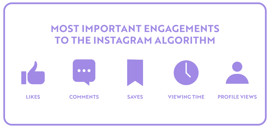
The Instagram algorithm works like this: if a user doesn’t engage with the initial image in a carousel post, the subsequent image will cause the post to reappear in their feed. This grants the user another opportunity to interact with your post, potentially increasing engagement.
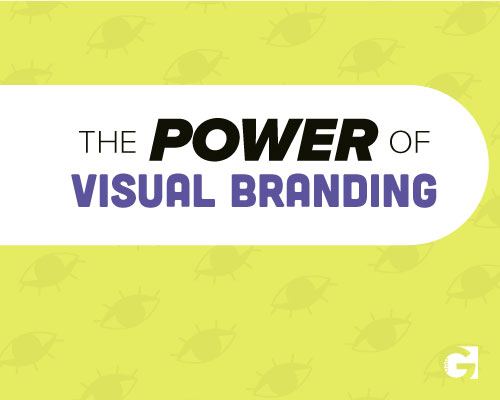
Infographics generally excel because they contain visually interesting graphics, and more importantly, text. This phenomenon can be explained quite simply: users spend time reading the textual content embedded within the image.
Neographic Media’s plan of action is to create a branded infographic, complete with three “minfographics” to upload as an Instagram carousel post. The term “minfographic” describes the smaller graphics elements that collectively make up a comprehensive infographic.
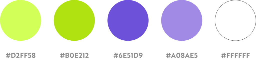
The final design must be seamlessly integrated with Neographic Media’s brand colors, typography, and logo to ensure brand consistency and recognition. This approach offers versatility, allowing the brand to utilize the design both in print and across digital platforms.
The Visionaries
Neographic Media is a dynamic graphic design brand that offers exceptional creative, photography, and social media services. The brand aims to inspire potential clients, illustrating the value they can bring to businesses seeking unique and impactful visual solutions.

Incorporating the brand logo, color palette, and typography into the infographic is essential to maintain a consistent and recognizable brand identity. Neographic Media values clean, modern aesthetics, so the design should reflect this preference.
Their Challenge
Visual branding is an important aspect of a business, but can often be overlooked. Part of the challenge is to convince an audience that visual branding is important to a brand’s success.
Moreover, this infographic is an opportunity to showcase Neographic Media’s knowledge of branding, draw attention to offered services, and build a broader client base. Ultimately, Neographic Media’s branded infographic carousel will work as a compelling invitation for businesses and individuals looking to elevate their visual branding and communications.
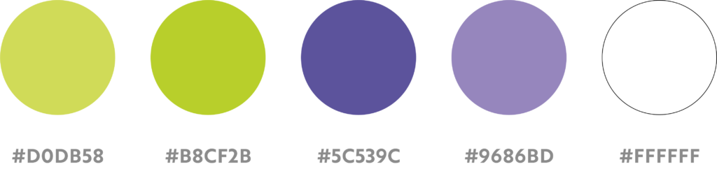
Infographic Ingenuity
Creating an infographic is familiar territory for Neographic Media. The challenge was embedding minfographics to create a cohesive final infographic design. In order to accomplish this task, we utilized a “Z” pattern layout to both guide viewers’ eyes through the image and achieve balance within the design.
Utilize brand colors, bold graphics, bolded keywords to ease digestibility. Our favorite detail has to be the cursor on the webpage URL. This adds interest to the text without overpowering it.
Slight stray in the color palette, but remains cohesive with the brand’s identity to improve text readability while maintaining a consistent layout.
Minimal readjustment of grid layout to create 5:4 squares for a series of Instagram carousels. This is an opportunity for a series of posts about this single infographic revealing the final design. They can drive Versatility as a social media post or a printed poster.
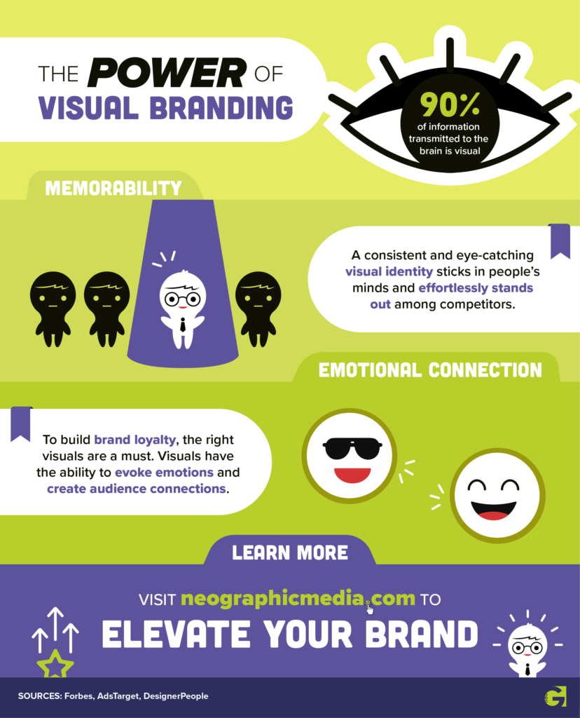
Carousel #1: Visual Branding
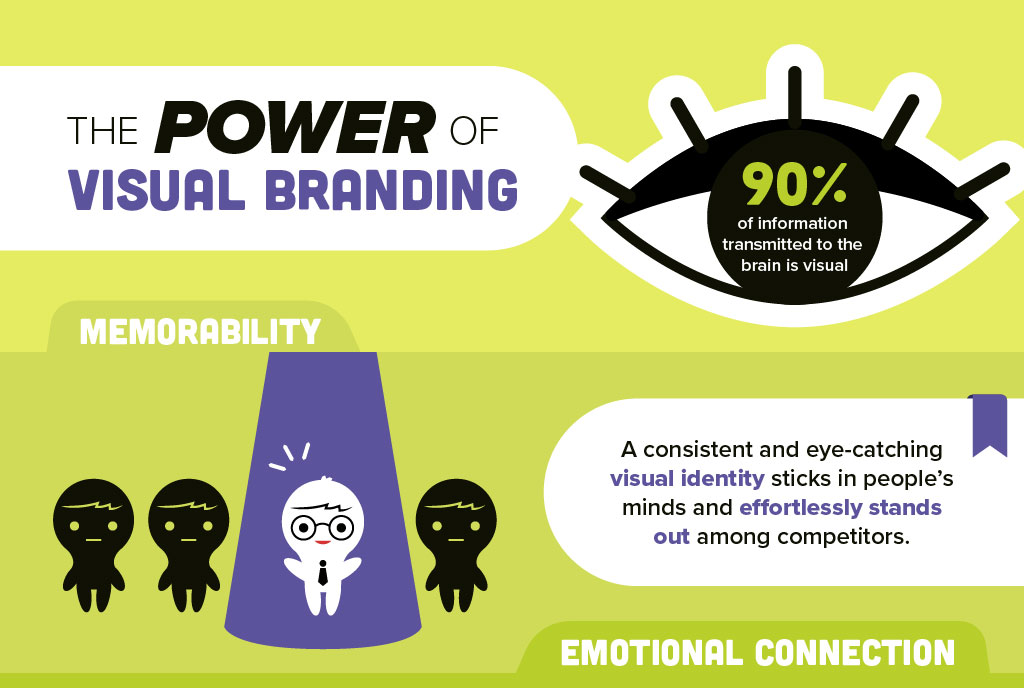
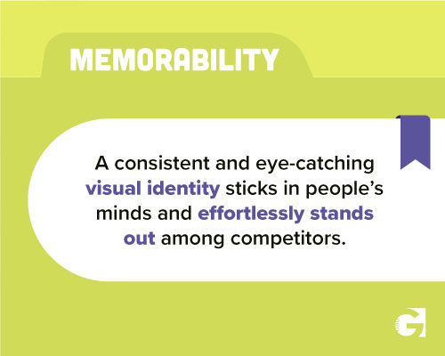
Carousel #2: Memorability

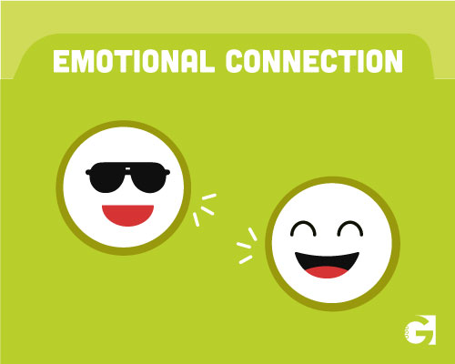
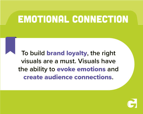
Carousel #3: Emotional Connection
Neographic Media’s Instagram page has a row layout, so we broke up the infographic into three separate carousel posts to achieve cohesion within the feed. Hashtags to further boost the posts.


