

Modernized Hometown Rebrand – Hartford, CT
Purpose:
Today, many towns have logos that have not been updated since the 1900s. This means that many of the logos we see feel outdated. The purpose of this project was to modernize the logo for Connecticut’s state capital, Hartford.
Logo Redesign:
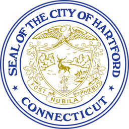
While we can appreciate the level of detail in Hartford’s current logo (pictured below), it has a very old-fashioned and serious feel. We want to modernize the logo to make Hartford give off a friendlier vibe.
Below are our redesigns for the city of Hartford:
The new logo form is friendlier and more modern. The lines breaking out of the outer circle give a feeling of motion and progression. which ties into its color palette that pulls from the transit line CT Fastrak. This green gives a sense of familiarity to locals and unity throughout the city to visitors.
Town Brochure:
Committing to the town’s rebrand, we took the liberty of designing a tourist brochure utilizing the modern style and color palette of the new logo design.
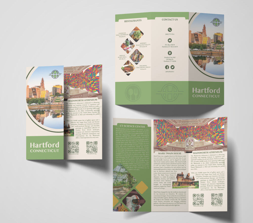
This brochure is complete with Hartford’s main attractions including the Connecticut Science Center, Mark Twain House, and Wadsworth Atheneum as well as the best restaurants. The back panel includes the city’s contact information and social media.
Closing:
Logo design impacts how people perceive a brand, or in this case a town. If your logo is outdated, it may seem that your company is outdated as well. After all, a logo is a reflection of your brand. As such, updating your logo design will reflect positive change and growth.


