Graphic Riffs: The Converters Logo Identity
A Visual Symphony
Neographic Media was tasked with creating a band logo identity for a new rock band called The Converters. The band requested that the final iteration capture an essence similar to that of the Guns and Roses logo. Additional logo requirements include that the final design must invoke rock culture, be easily visualized, include identifiable text, and display the band’s website.
Client Spotlight
The Converters is an edgy, up-and-coming rock band that holds a deep admiration for the iconic rock band Guns N’ Roses. so far, the band has amassed an audience comprised of people ages 25 through 60 with a taste for classic rock, blues, and biker music.
The final logo identity must accurately reflect the band’s musical persona and appeal to its broad audience.
Harmonizing Concepts
This logo is a visual identity for The Converters, meaning it must resonate with the band’s existing audience and appeal to a broader audience. Referencing a blues, rock, and biker culture similar to Guns and Roses accomplishes this task perfectly. A logo that associates The Converters with these attributes will easily attract the right audience.
Furthermore, the band’s website as part of the logo is a golden opportunity to drive website traffic among current and potential audiences.
Amplifying Band Recognition
Neographic Media has never had to design a band logo before, so this was a fun challenge. Thorough research went into dissecting the essence of rock, blues, and biker culture to effectively achieve the objectives of this design project.
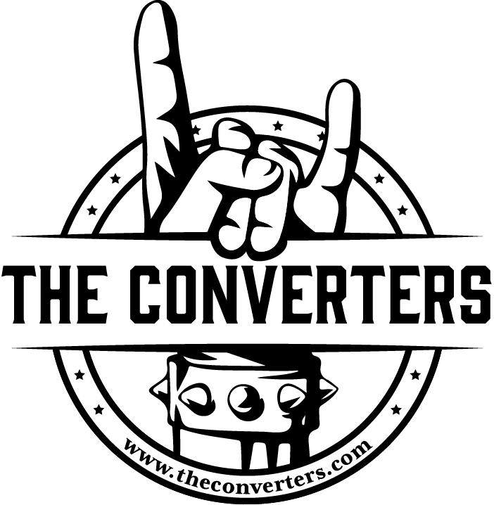
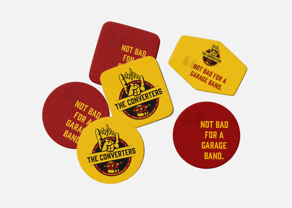
Symbols were huge when looking into the culture. There is plenty of imagery that encompasses rock culture alone. During the brainstorming process, we considered musical concepts, but ultimately settled on the iconic rock n’ roll hand gesture. This symbol unapologetically exudes rock culture, and the spiked cuff adds an edgy flare.
The first iteration of The Converters logo was nearly a success. We made one minor change to the final design: the sound wave between the fingers. This was a perfect final touch to unify the logo identity with the electrifying band name.
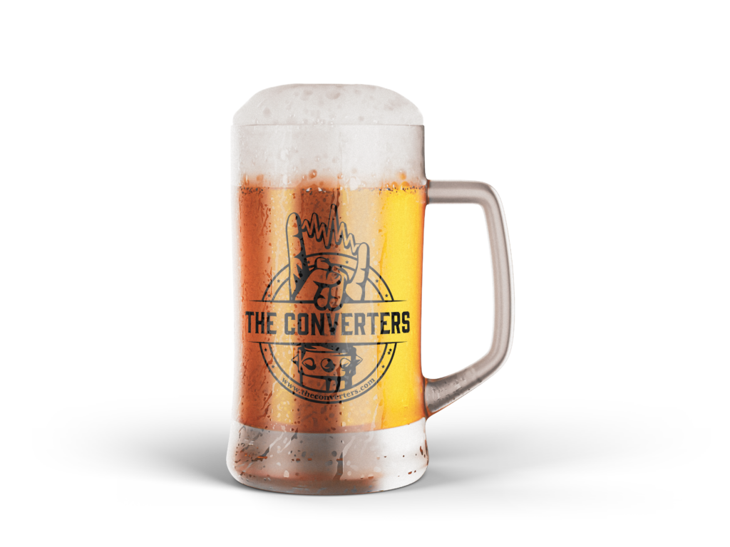
Moreover, the chosen color palette is inspired by Guns N’ Roses. The iconic logo utilizes red and yellow, so we used similar colors in a new way. Additionally, the type treatment has an eclectic feel and can stand independently as a band logo.