A Visual Symphony
Neographic Media was tasked with creating a band logo identity for a new rock band called The Converters. The band requested that the final iteration capture an essence similar to that of the existing Guns N’ Roses logo. Additionally, the final logo design must invoke rock culture, include identifiable text, be easily visualized, and readily display the band’s website.
Client Spotlight
The edgy, up-and-coming rock band holds a deep admiration for the iconic Guns N’ Roses. So far, the band has amassed an audience comprised of people ages 25 through 60 with a taste for classic rock, blues, and biker music, meaning the final logo must accurately reflect the band’s musical persona and appeal to its established audience.
Harmonizing Concepts
The final visual identity must not only resonate with the band’s current audience but attract new fans as well. Utilizing symbols and imagery associated with blues, rock, and biker culture, similar to the Guns N’ Roses logo, will accomplish this task perfectly. An identity that associates The Converters with these attributes will effortlessly attract the right audience. Adding the band’s website into logo could be a golden opportunity to drive web traffic among existing and potential audiences.
Amplifying Band Recognition
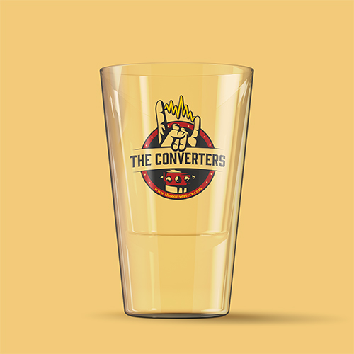
Thorough research went into dissecting the essence of rock, blues, and biker culture to effectively achieve the objectives of this design project. Symbols were huge when looking into the culture. There is plenty of imagery that encompasses rock culture alone. During the brainstorming process, we considered musical concepts, but ultimately settled on the iconic rock n’ roll hand gesture. This symbol unapologetically exudes rock culture, and the spiked cuff adds an edgy flare.
The first iteration of The Converters logo was nearly a success. We made one minor change to the final design: the sound wave between the fingers. This was a perfect final touch to unify the logo identity with the electrifying band name.
Moreover, the chosen color palette is inspired by Guns N’ Roses. The iconic logo utilizes red and yellow, so we used similar colors in a new way. Additionally, the chosen type treatment has an eclectic feel and can stand independently as a band logo.


Final Thoughts
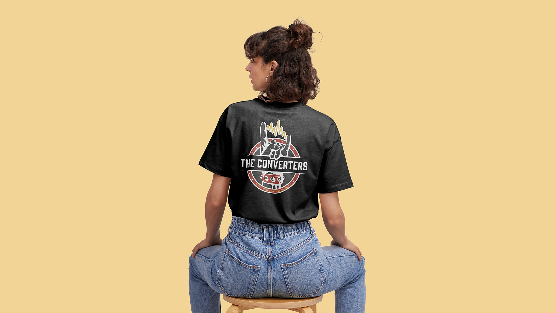
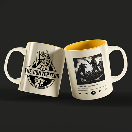
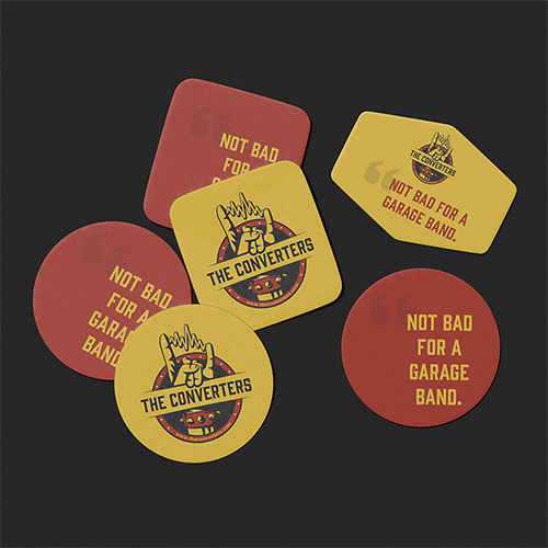
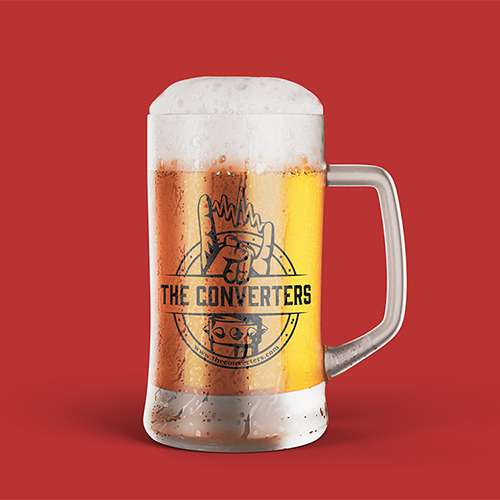
The aspect of this project with the most payoff was the merch design. Each piece displays the final logo in a unique light and solidifies a unified visual identity for The Converters. Merch is more than simply slapping a logo onto an item; this process requires careful consideration of color variations and production processes. We even explored the addition of supporting graphics to achieve a unique interest and distinct look to each product.
This project ultimately pushed our capabilities as designers, attempting a new style that strays from our typical aesthetic. We were ultimately able to get out of our comfort zones and enter the world of rock n’ roll, emphasizing once again that every project requires its own research process and iterative approach.